Customize Consent Preferences

We use cookies to help you navigate efficiently and perform certain functions. You will find detailed information about all cookies under each consent category below.

The cookies that are categorized as "Necessary" are stored on your browser as they are essential for enabling the basic functionalities of the site. ... 

Always Active

Necessary cookies are required to enable the basic features of this site, such as providing secure log-in or adjusting your consent preferences. These cookies do not store any personally identifiable data.

No cookies to display.

Functional cookies help perform certain functionalities like sharing the content of the website on social media platforms, collecting feedback, and other third-party features.

No cookies to display.

Analytical cookies are used to understand how visitors interact with the website. These cookies help provide information on metrics such as the number of visitors, bounce rate, traffic source, etc.

No cookies to display.

Performance cookies are used to understand and analyze the key performance indexes of the website which helps in delivering a better user experience for the visitors.

No cookies to display.

Advertisement cookies are used to provide visitors with customized advertisements based on the pages you visited previously and to analyze the effectiveness of the ad campaigns.

No cookies to display.

Flowers Suitable for Art Painting

Flowers Suitable for Art Painting

I am no botanic artist and I am too old to learn and train but I do appreciate a good source photograph to paint in oils.

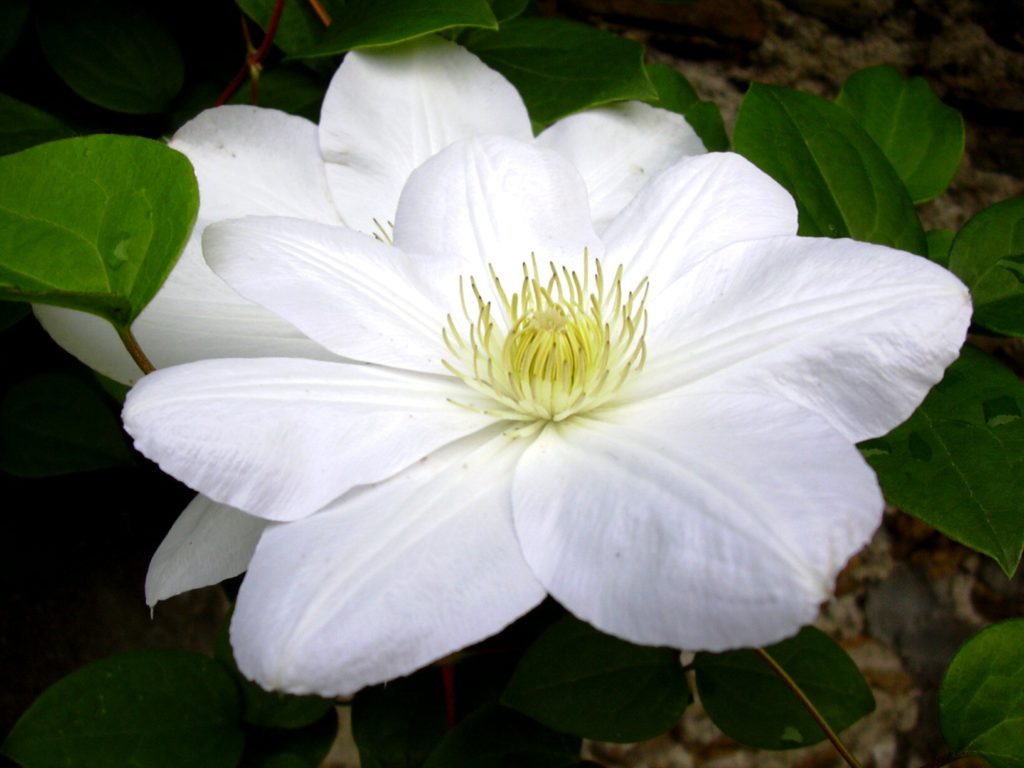
This clematis bloom captured at an RHS trial gave me inspiration to get it painted.

Colours Contrast and Tone

  1. Seldom are white flowers exclusively white but a mix of many colours and shades. School boy physics explained that white light could be split by a prism into all the colours of the rainbow.
  2. The light source is full-on yet there are graduations of tone that stop short of full shadows.
  3. The overlaid petals and the veins seem lighter and brighter.
  4. The bottom leaves are dark blue-green which helps them to recede and provide much needed contrast.
  5. Aesthetically I like the pistels and the lime green colouring.

Composition

  1. The focal point is the flowers center. I could drop the intruding leaf from the left if I thought it conflicted with the prime focus but the round shape is pleasing.
  2. The picture takes the eye round in a series of circles and ellipses and keeps the eye within the frame.
  3. The colour scheme is simple and not too complex but the execution may be more problematic.
  4. The focal point may be a bit too central but is offset by the second flower. In any event the final painting can be skewed left or right if desired.

I will attempt a painting and ‘may’ even show the result later

Comments are closed.